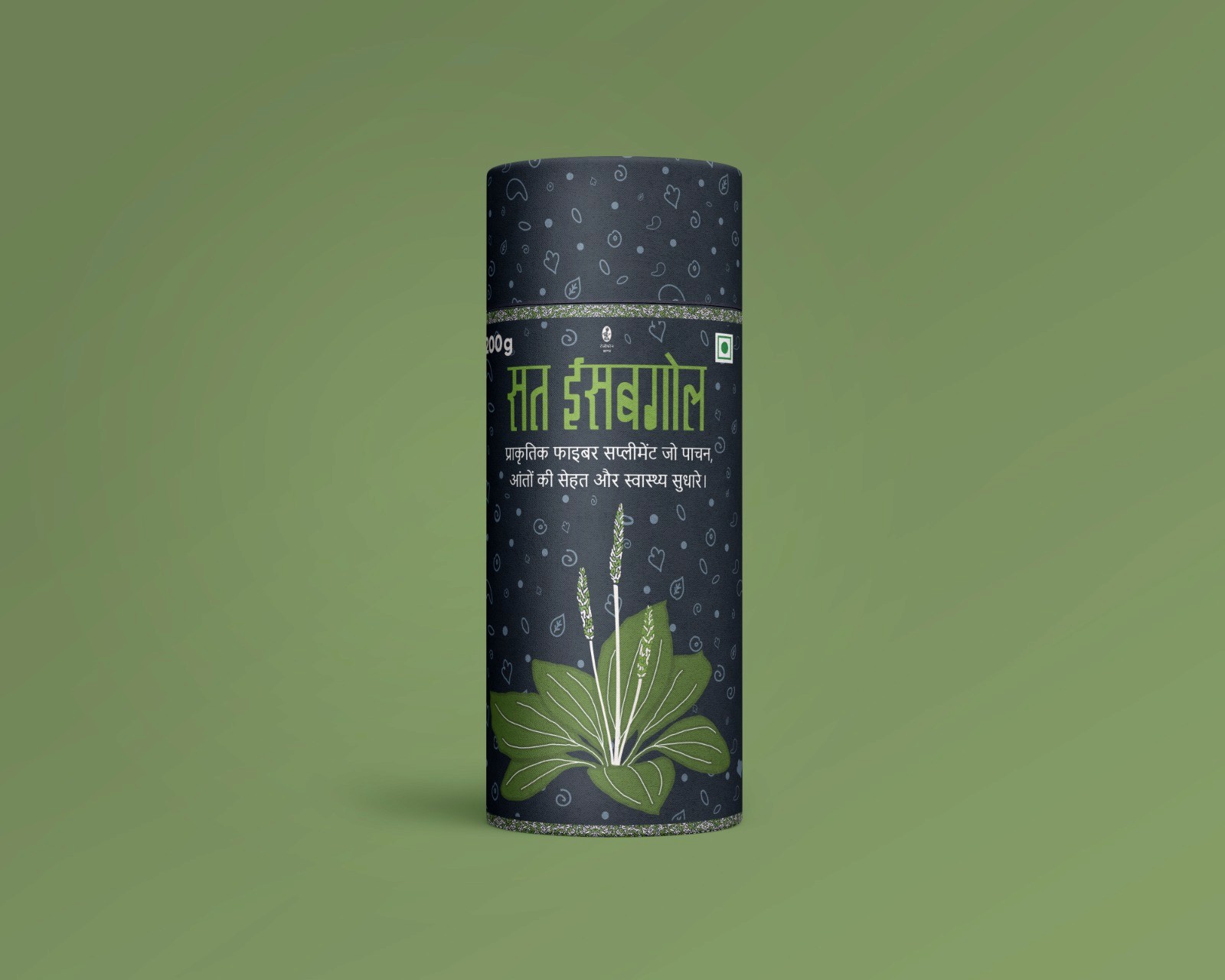
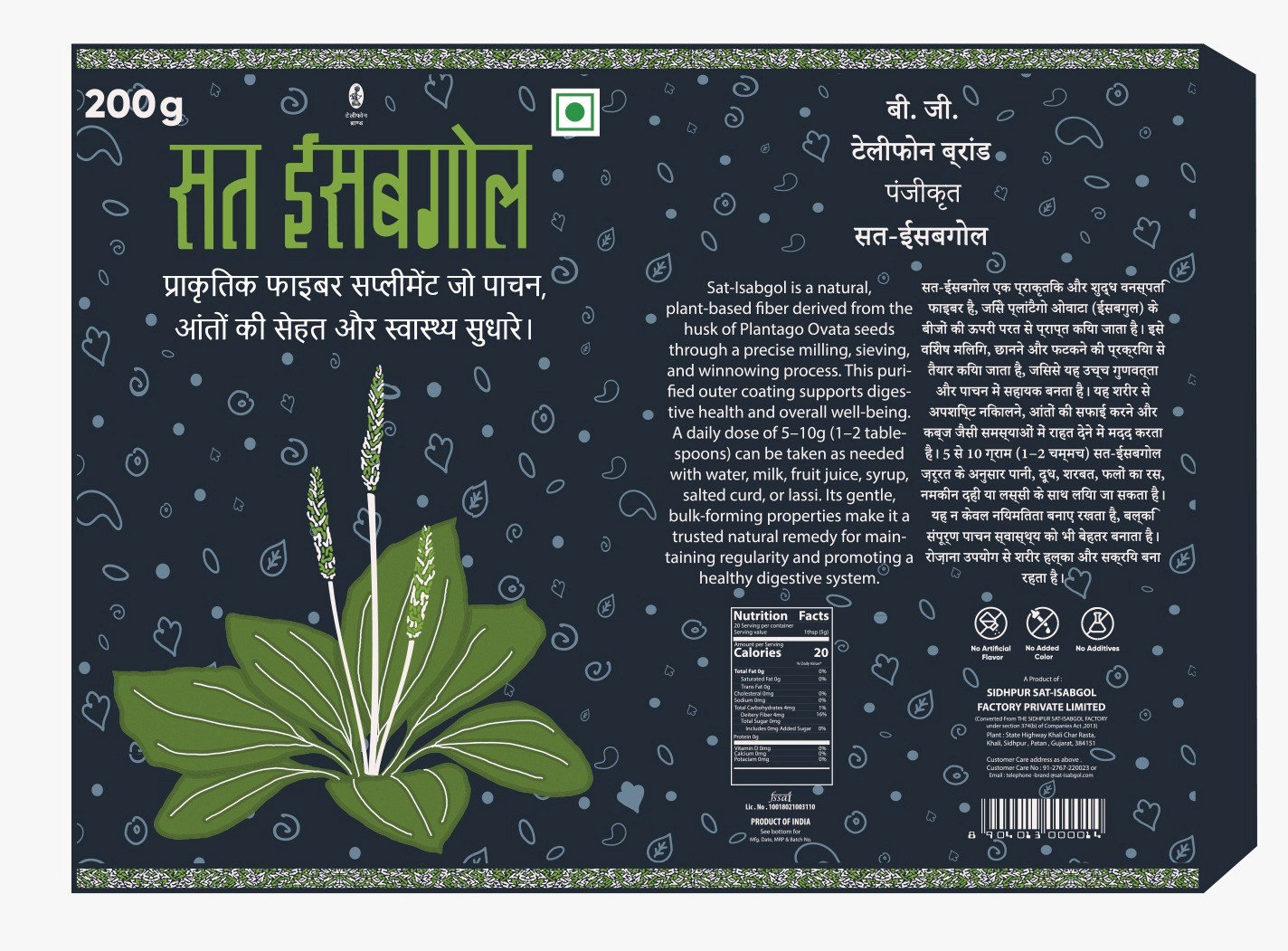
Sat Isabgol: Refreshing the Look of a Trusted Classic
Sat Isabgol has been a household name in digestive wellness for generations. Known for its effectiveness and legacy, the product packaging had remained largely unchanged for decades. The goal of this redesign was to retain the brand’s heritage while giving the packaging a modern, clean, and retail-ready update—one that resonates with today’s health-conscious buyers without disrupting its deep-rooted familiarity.
Services :
Packaging
THE CHALLENGE
The key challenge was to modernize the packaging without altering the core visual identity of Sat Isabgol. Its original design—with bold fonts, vibrant colors, and extensive information—had strong recall value. However, the design lacked visual hierarchy, contemporary appeal, and clarity for newer consumers. The task was to refine and declutter the layout, enhance legibility, and introduce a cleaner structure, all while preserving brand trust.

THE RESEARCH
We carefully studied legacy packaging elements—such as font styles, layout structure, color choices, and label language. A comparative review of traditional Ayurvedic and fiber supplement packaging helped identify opportunities to simplify the design without losing brand authenticity. Packaging psychology principles guided decisions around information placement, font clarity, and consumer trust signals (like dosage, certifications, and benefits).
THE SOLUTION
The updated packaging design of Sat Isabgol brings forward a cleaner, more structured visual system. The use of clearer typefaces, improved spacing, and reorganized content hierarchy enhances usability and readability. Core color elements and heritage details have been thoughtfully preserved, ensuring existing users still recognize the brand. The result is a refreshed design that respects the legacy while making the product more approachable and shelf-competitive for the modern consumer.
NEXT PROJECT

Branding & Visual Identity